Colors make changes in visual effects. This post collected and excerpted all Pantone color trends from the past decade, where they can be used as fundamental colors for flat/graphic design and creative collections for all materials such as magazines and plane material. The color wheel on the cover (clockwised) is a gradient from these past popular colors in decades, showcasing the transitions on color and the conversion over the decade and consequently reflecting the colors’ changes over the time.
不同的颜色在视觉效果上有着显著的差别。以下我们整理了近十年的Pantone色彩流行趋势,可以用于日常的页面设计基础色轮,以及期刊创意素材。封面上的色轮(顺时针方向)是这十种流行色的拼合,借以这种方式展示不同年间的色彩过渡与变化,反映出色彩随时间而变化的效果。
Note: In fact, the color trend is obtained from flat printing. Therefore, unlike colors shown in monitors, all these color might have slight differences in different color gamuts (like RGB, CMYK and so on). Therefore, the actual color selection should be based on the color of the physical medium - paper. All colors on the screen are only the approximate colors under the RGB color gamuts. For the real color coordinates, you can find the exact values based on the Pantone color system in Adobe Stock and get (with charged only) the corresponding color coordinations.
注意:实际上,该色彩流行趋势是以平面印刷为出发点得到的。因此,与显示器色彩不同,该颜色在不同色域(RGB、CMYK等)中都存在细微的差异。因此,颜色的真实选取应以纸张颜色呈现为标准。屏幕中的所有颜色均是在RGB框架下的近似颜色。有关真实的颜色坐标,可在Adobe Stock中检查Pantone色系中的准确数值,并获取(付费的)其对应的色彩信息。
You can also follow this site for annual update: https://www.pantone.com/articles/color-of-the-year/, with more elegant matchings to each respective annual color.
你可以通过Pantone官方网站获取年度更新,在网页中还包括了与每一年度主题相关的色彩搭配可供选择。
2023: Viva Magenta 18-750
RGB Substitution: #ac344b
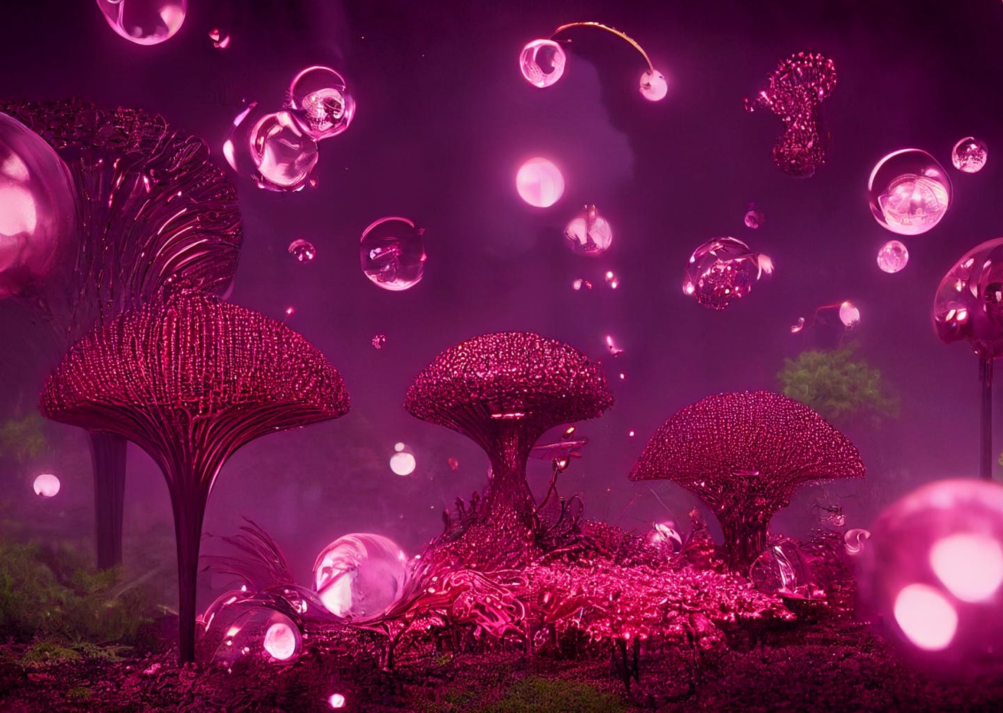 Viva Magenta vibrates with vim and vigor. It is a shade rooted in nature descending from the red family and expressive of a new signal of strength. Viva Magenta is brave and fearless, a pulsating color whose exuberance promotes a joyous and optimistic celebration, writing a new narrative.
This color of is powerful and empowering. It is an animated red that revels in pure joy, encouraging experimentation and self-expression without restraint, an electrifying, and a boundless shade that is manifesting as a stand-out statement. PANTONE 18-1750 Viva Magenta welcomes anyone and everyone with the same verve for life and rebellious spirit. It is a color that is audacious, full of wit and inclusive of all.
As a nuanced crimson red tone that presents a balance between warm and cool, it is also a hybrid color, one that comfortably straddles the physical and virtual in our multi-dimensional world. It is assertive, but not aggressive, a carmine red that does not boldly dominate but instead takes a “fist in a velvet glove” approach. Exuding dynamism, it is a transformative red tone capable of driving design to create a more positive future. As we balance our digital and physical lives, we continue to grow our appreciation for the natural world. The Color of the Year 2023 acknowledges our gravitational pull towards natural colors as movements swell around climate change, sustainability, and land protection.
In this year’s Color of the Year selection process, Pantone observed a heightened appreciation and awareness of nature represented by countless lifestyle trends. We’re incorporating more living things into our homes, such as plants, florals, living walls, and restorative outdoor spaces. We’re finding newfound enjoyment in travel, sports, and outdoor recreation after pausing these activities during the pandemic. We’re more careful to protect our bodies as a result of the public health crises — we look to apply and ingest trusted, life-giving ingredients. All of these lifestyle trends speak to the heartiness of natural forces.
Viva Magenta’s organic origins hail from the cochineal beetle. This insect produces carmine dye, one of the most precious, strongest, and brightest of the natural dye family. The red tone of Viva Magenta connects us to original matter, imbibing us with a primordial signal of strength.
The Color of the Year 2023 merges the richness, warmth, and strength of natural matters with the rich, open horizons of the digital world. The result is a shade of red that expands our horizons of authenticity. The metaverse creates new opportunities for us to express ourselves, and the raw fortitude of Viva Magenta inspires us to do so with confidence and bravery.
2022: Very Peri 18-1750
RGB Substitution: #6868ac
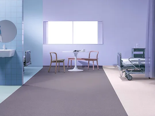 Very Peri: encouraging personal inventiveness and creativity
Displaying a carefree confidence and a daring curiosity that animates our creative spirit, inquisitive and intriguing PANTONE 17-3938 Very Peri places the future ahead in a new light. We are living in transformative times. PANTONE 17-3938 Very Peri is a symbol of the global zeitgeist of the moment and the transition we are going through. As we emerge from an intense period of isolation, our notions and standards are changing, and our physical and digital lives have merged in new ways.
The Pantone Color of the Year reflects what is taking place in our global culture, expressing what people are looking for that color can hope to answer.
2021: Illuminating 13-0647 + Ultimate Gray 17-5104
RGB Substitution: #f7e00e for Illuminating, and #939599 for Ultimate Gray
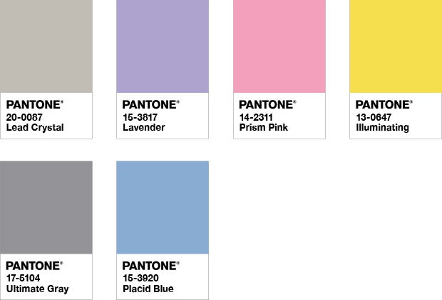
A MARRIAGE OF COLOR CONVEYING A MESSAGE OF STRENGTH AND HOPEFULNESS THAT IS BOTH ENDURING AND UPLIFTING.
PANTONE 17-5104 Ultimate Gray + PANTONE 13-0647 Illuminating, two independent colors that highlight how different elements come together to support one another, best express the mood for Pantone Color of the Year 2021. Practical and rock solid but at the same time warming and optimistic, the union of PANTONE 17-5104 Ultimate Gray + PANTONE 13-0647 Illuminating is one of strength and positivity. It is a story of color that encapsulates deeper feelings of thoughtfulness with the promise of something sunny and friendly.
A message of happiness supported by fortitude, the combination of PANTONE 17-5104 Ultimate Gray + PANTONE 13-0647 Illuminating is aspirational and gives us hope. We need to feel that everything is going to get brighter – this is essential to the human spirit.
As people look for ways to fortify themselves with energy, clarity, and hope to overcome the continuing uncertainty, spirited and emboldening shades satisfy our quest for vitality. PANTONE 13-0647 Illuminating is a bright and cheerful yellow sparkling with vivacity, a warming yellow shade imbued with solar power. PANTONE 17-5104 Ultimate Gray is emblematic of solid and dependable elements which are everlasting and provide a firm foundation. The colors of pebbles on the beach and natural elements whose weathered appearance highlights an ability to stand the test of time, Ultimate Gray quietly assures, encouraging feelings of composure, steadiness and resilience.
2020: Classic Blue 19-4052
RGB Substitution: #0f4c81

INSTILLING CALM, CONFIDENCE, AND CONNECTION, THIS ENDURING BLUE HUE HIGHLIGHTS OUR DESIRE FOR A DEPENDABLE AND STABLE FOUNDATION ON WHICH TO BUILD AS WE CROSS THE THRESHOLD INTO A NEW ERA.
A timeless and enduring blue hue, PANTONE 19-4052 Classic Blue is elegant in its simplicity. Suggestive of the sky at dusk, the reassuring qualities of the thought-provoking PANTONE 19-4052 Classic Blue highlight our desire for a dependable and stable foundation on which to build as we cross the threshold into a new era.
Imprinted in our psyches as a restful color, PANTONE 19-4052 Classic Blue brings a sense of peace and tranquility to the human spirit, offering refuge. Aiding concentration and bringing laser like clarity, PANTONE 19-4052 Classic Blue re-centers our thoughts. A reflective blue tone, Classic Blue fosters resilience.
As technology continues to race ahead of the human ability to process it all, it is easy to understand why we gravitate to colors that are honest and offer the promise of protection. Non-aggressive and easily relatable, the trusted PANTONE 19-4052 Classic Blue lends itself to relaxed interaction. Associated with the return of another day, this universal favorite is comfortably embraced.
2019: Living Coral 16-1546
RGB Substitution: #ff6f61
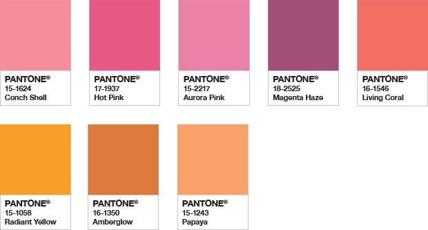 AN ANIMATING AND LIFE-AFFIRMING CORAL HUE WITH A GOLDEN UNDERTONE THAT ENERGIZES AND ENLIVENS WITH A SOFTER EDGE.
Vibrant, yet mellow PANTONE 16-1546 Living Coral embraces us with warmth and nourishment to provide comfort and buoyancy in our continually shifting environment.
In reaction to the onslaught of digital technology and social media increasingly embedding into daily life, we are seeking authentic and immersive experiences that enable connection and intimacy. Sociable and spirited, the engaging nature of PANTONE 16-1546 Living Coral welcomes and encourages lighthearted activity. Symbolizing our innate need for optimism and joyful pursuits, PANTONE 16-1546 Living Coral embodies our desire for playful expression.
Representing the fusion of modern life, PANTONE Living Coral is a nurturing color that appears in our natural surroundings and at the same time, displays a lively presence within social media.
PANTONE 16-1546 Living Coral emits the desired, familiar, and energizing aspects of color found in nature. In its glorious, yet unfortunately more elusive, display beneath the sea, this vivifying and effervescent color mesmerizes the eye and mind. Lying at the center of our naturally vivid and chromatic ecosystem, PANTONE Living Coral is evocative of how coral reefs provide shelter to a diverse kaleidoscope of color.
2018: Ultra Violet 18-3838
RGB Substitution: #5f4b8b
 INVENTIVE AND IMAGINATIVE, ULTRA VIOLET LIGHTS THE WAY TO WHAT IS YET TO COME.
A dramatically provocative and thoughtful purple shade, PANTONE 18-3838 Ultra Violet communicates originality, ingenuity, and visionary thinking that points us toward the future.
Complex and contemplative, Ultra Violet suggests the mysteries of the cosmos, the intrigue of what lies ahead, and the discoveries beyond where we are now. The vast and limitless night sky is symbolic of what is possible and continues to inspire the desire to pursue a world beyond our own.
Enigmatic purples have also long been symbolic of counterculture, unconventionality, and artistic brilliance. Musical icons Prince, David Bowie, and Jimi Hendrix brought shades of Ultra Violet to the forefront of western pop culture as personal expressions of individuality. Nuanced and full of emotion, the depth of PANTONE 18-3838 Ultra Violet symbolizes experimentation and non-conformity, spurring individuals to imagine their unique mark on the world, and push boundaries through creative outlets.
Historically, there has been a mystical or spiritual quality attached to Ultra Violet. The color is often associated with mindfulness practices, which offer a higher ground to those seeking refuge from today’s over-stimulated world. The use of purple-toned lighting in meditation spaces and other gathering places energizes the communities that gather there and inspire connection.
2017: Greenery 15-0343
RGB Substitution: #88b04b
 A REFRESHING AND REVITALIZING SHADE, GREENERY IS SYMBOLIC OF NEW BEGINNINGS.
Greenery is a fresh and zesty yellow-green shade that evokes the first days of spring when nature’s greens revive, restore and renew. Illustrative of flourishing foliage and the lushness of the great outdoors, the fortifying attributes of Greenery signals consumers to take a deep breath, oxygenate and reinvigorate.
Greenery is nature’s neutral. The more submerged people are in modern life, the greater their innate craving to immerse themselves in the physical beauty and inherent unity of the natural world. This shift is reflected by the proliferation of all things expressive of Greenery in daily lives through urban planning, architecture, lifestyle and design choices globally. A constant on the periphery, Greenery is now being pulled to the forefront - it is an omnipresent hue around the world.
A life-affirming shade, Greenery is also emblematic of the pursuit of personal passions and vitality.
2016: Rose Quartz 13-1520 + Serenity 15-3919
RGB Substitution: #f7cac9 for Rose Quartz, and 92a8d1 for Serenity
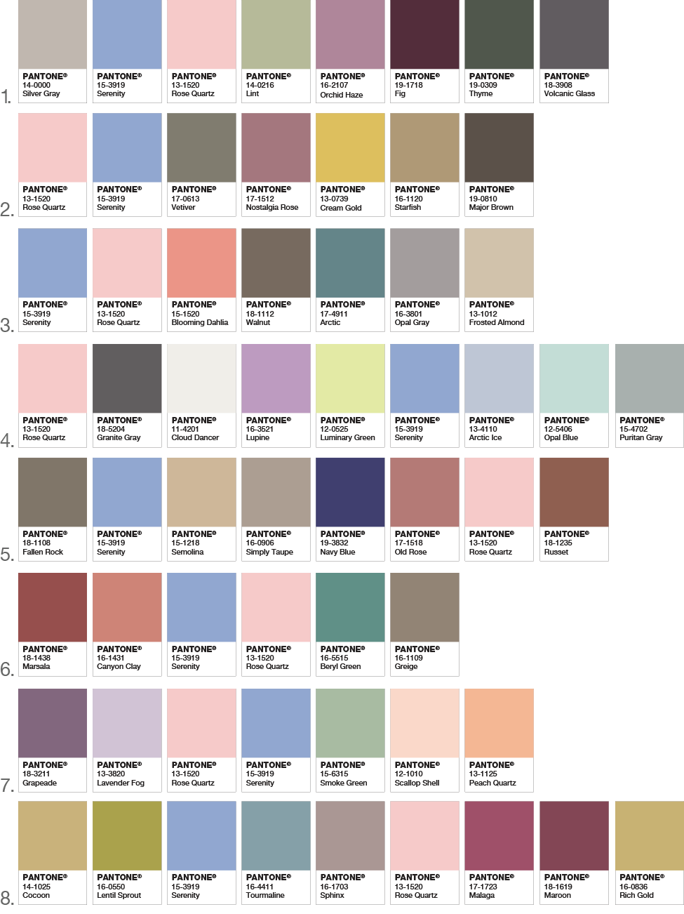 A SOFTER TAKE ON COLOR FOR 2016: FOR THE FIRST TIME, THE BLENDING OF TWO SHADES – ROSE QUARTZ AND SERENITY ARE CHOSEN AS THE PANTONE COLOR OF THE YEAR.
As consumers seek mindfulness and well-being as an antidote to modern day stresses, welcoming colors that psychologically fulfill our yearning for reassurance and security are becoming more prominent. Joined together, Rose Quartz and Serenity demonstrate an inherent balance between a warmer embracing rose tone and the cooler tranquil blue, reflecting connection and wellness as well as a soothing sense of order and peace.
The prevalent combination of Rose Quartz and Serenity also challenges traditional perceptions of color association.
In many parts of the world we are experiencing a gender blur as it relates to fashion, which has in turn impacted color trends throughout all other areas of design. This more unilateral approach to color is coinciding with societal movements toward gender equality and fluidity, the consumer’s increased comfort with using color as a form of expression, a generation that has less concern about being typecast or judged and an open exchange of digital information that has opened our eyes to different approaches to color usage.
2015: Marsala 18-1438
RGB Substitution: #955251

Much like the fortified wine that gives Marsala its name, this tasteful hue embodies the satisfying richness of a fulfilling meal while its grounding red-brown roots emanate a sophisticated, natural earthiness. This hearty, yet stylish tone is universally appealing and translates easily to fashion, beauty, industrial design, home furnishings and interiors.
Equally appealing to men and women, Marsala is a stirring and flavorful shade for apparel and accessories, one that encourages color creativity and experimentation Flattering against many skin tones, sultry and subtle Marsala is a great go-to color for beauty, providing enormous highlight for the cheek, and a captivating pop of color for nails, shadows lips and hair.
Dramatic and at the same time grounding, the rich and full-bodied red-brown Marsala brings color warmth into home interiors.
An earthy shade with a bit of sophistication, texture is the story in print and packaging. A matte finish highlights Marsala’s organic nature while adding a sheen conveys a completely different message of glamour and luxury.
2014: Radiant Orchid 18-3224
RGB Substitution: #B163a3
 EXPRESSIVE, EXOTIC RADIANT ORCHID BLOOMS WITH CONFIDENCE AND WARMTH.
Radiant Orchid for Fashion
Radiant Orchid’s rosy undertones radiate on the skin, producing a healthy glow when worn by both men and women. A dazzling attention-getter, Radiant Orchid permeated the runways during the spring 2014 fashion shows and is already making its way onto the red carpet. Fashion designers featured in the PANTONE Fashion Color Report Spring 2014, including Emerson by Jackie Fraser-Swan, Juicy Couture and Yoana Baraschi, are incorporating Radiant Orchid into their spring collections and variations of this hue will carry into men’s and women’s clothing and accessories throughout next year.
Radiant Orchid for Beauty
A modern and surprisingly versatile shade, Radiant Orchid enlivens the skin, making all who wear it feel more healthy and energetic. Blending both cool and warm undertones, purple is an appealing hue for distinctive combinations and flattering to many hair, eye and skin tones.
This multifaceted hue is seductive when combined with red and pairs well with its sister shades of lavender, purple and pink, which provides an assortment of lipstick and blush options. Radiant Orchid’s exuberance also acts as a brilliant finishing touch to nails.
2013: Emerald 17-5641
RGB Substitution: #009b77
 A LIVELY, RADIANT, LUSH GREEN, IS THE COLOR OF THE YEAR FOR 2013.
The 2012 color of the year, PANTONE 17-1463 Tangerine Tango, a spirited reddish orange, provided the energy boost we needed to recharge and move forward. Emerald, a vivid verdant green, enhances our sense of well-being further by inspiring insight as well as promoting balance and harmony.
Most often associated with brilliant, precious gemstones, the perception of Emerald is sophisticated and luxurious. Since antiquity, this luminous, magnificent hue has been the color of beauty and new life in many cultures and religions. Also the color of growth, renewal and prosperity, no other color conveys regeneration more than green. For centuries, many countries have chosen green to represent healing and unity.
“The most abundant hue in nature, the human eye sees more green than any other color in the spectrum,” said Leatrice Eiseman, executive director of the Pantone Color Institute®. “As it has throughout history, multifaceted Emerald continues to sparkle and fascinate. Symbolically, Emerald brings a sense of clarity, renewal and rejuvenation, which is so important in today’s complex world. This powerful and universally-appealing tone translates easily to both fashion and home interiors.”
Explore this page. Find out more about this radiant jewel tone and its many applications in fashion, beauty, home décor and design. Dig deeper into the thinking and decision-making process that answers why, of the nearly infinite range of colors perceivable by the human eye, 17-5641 Emerald captured our attention, our imagination and our collective eye to become this year’s selection as the Pantone 2013 Color of the Year.
2012: Tangerine Tango 17-1463
RGB Substitution: #e2492f
 DANCE INTO THE NEW YEAR WITH THIS VIVACIOUS AND APPEALING REDDISH ORANGE
The 2011 color of the year, PANTONE 18-2120 Honeysuckle, encouraged us to face everyday troubles with verve and vigor. Tangerine Tango, a spirited reddish orange, continues to provide the energy boost we need to recharge and move forward.
“Sophisticated but at the same time dramatic and seductive, Tangerine Tango is an orange with a lot of depth to it,” said Leatrice Eiseman, executive director of the Pantone Color Institute®. “Reminiscent of the radiant shadings of a sunset, Tangerine Tango marries the vivaciousness and adrenaline rush of red with the friendliness and warmth of yellow, to form a high-visibility, magnetic hue that emanates heat and energy.”
Over the past several years, orange has grown in popularity and acceptance among designers and consumers alike. A provocative attention-getter, Tangerine Tango is especially appealing in men’s and women’s fashion. Fashion designers featured in the PANTONE Fashion Color Report Spring 2012, including Tommy Hilfiger, Nanette Lepore, Cynthia Steffe by Shaun Kearney, Elie Tahari and Adrienne Vittadini, are incorporating this attractive orange into their spring collections. A fun, lively take on a traditional autumnal hue, Tangerine Tango will surely carry through to fall fashion as well.
A winner in cosmetics because of its versatility, Tangerine Tango is a bit exotic, but in a very friendly, non-threatening way. Add a sultry flair to lips, cheeks and nails with Tangerine Tango. An unexpected eye shadow color, Tangerine Tango is a complementary opposite that flatters blue or green eyes. When paired with brown eyes, it brings out an amber cast.
Energize interior spaces with Tangerine Tango patterned home accessories. Pillows, bedspreads and tabletop accessories in this high-impact hue add spice to any room. Or incorporate Tangerine Tango appliances and personal electronics for an unexpected pop of color. Looking for an inexpensive way to perk up your home? Paint a wall in Tangerine Tango for a dynamic burst of energy in the kitchen, entryway or hallway.
2011: Honeysuckle 18-2120
RGB Substitution: #cb6586
 A COLOR FOR ALL SEASONS: COURAGEOUS. CONFIDENT. VITAL. A BRAVE NEW COLOR, FOR A BRAVE NEW WORLD. LET THE BOLD SPIRIT OF HONEYSUCKLE INFUSE YOU, LIFT YOU AND CARRY YOU THROUGH THE YEAR. IT’S A COLOR FOR EVERY DAY – WITH NOTHING “EVERYDAY” ABOUT IT.
While the 2010 color of the year, PANTONE 15-5519 Turquoise, served as an escape for many, Honeysuckle emboldens us to face everyday troubles with verve and vigor. A dynamic reddish pink, Honeysuckle is encouraging and uplifting. It elevates our psyche beyond escape, instilling the confidence, courage and spirit to meet the exhaustive challenges that have become part of everyday life.
“In times of stress, we need something to lift our spirits. Honeysuckle is a captivating, stimulating color that gets the adrenaline going – perfect to ward off the blues,” explains Leatrice Eiseman, executive director of the Pantone Color Institute®. “Honeysuckle derives its positive qualities from a powerful bond to its mother color red, the most physical, viscerally alive hue in the spectrum.”
Eiseman continues, “The intensity of this festive reddish pink allures and engages. In fact, this color, not the sweet fragrance of the flower blossoms for which it was named, is what attracts hummingbirds to nectar. Honeysuckle may also bring a wave of nostalgia for its associated delicious scent reminiscent of the carefree days of spring and summer.”
Honeysuckle is guaranteed to produce a healthy glow when worn by both men and women. It’s a striking, eye-catching hue that works well for day and night in women’s apparel, accessories and cosmetics, and in men’s ties, shirts and sportswear. Add a lively flair to interior spaces with Honeysuckle patterned pillows, bedspreads, small appliances and tabletop accessories. Looking for an inexpensive way to perk up your home? Paint a wall in Honeysuckle for a dynamic burst of energy in the family room, kitchen or hallway.
2010: Turquoise 15-5519
RGB Substitution: #10a7a3

Pantone is pleased to announce PANTONE 15-5519 Turquoise, an inviting, luminous hue, as the Color of the Year for 2010. Combining the serene qualities of blue and the invigorating aspects of green, Turquoise inspires thoughts of soothing, tropical waters and a comforting escape from the everyday troubles of the world, while at the same time restoring our sense of wellbeing.
In many cultures, Turquoise is believed to be a protective talisman, a color of deep compassion and healing, and a color of faith and truth, inspired by water and sky. Through years of color word-association studies, we also find that to many people, Turquoise represents an escape, taking them to a tropical paradise that is pleasant and inviting – even if it is only a fantasy.
Whether envisioned as a tranquil ocean surrounding a tropical island or a protective stone warding off evil spirits, Turquoise is a color that most people respond to positively. It is universally flattering, has appeal for men and women, and translates easily to fashion and interiors. With both warm and cool undertones, Turquoise pairs nicely with any other color in the spectrum. Turquoise adds a splash of excitement to neutrals and browns, complements reds and pinks, creates a classic maritime look with deep blues, livens up all other greens, and is especially trend-setting with yellow-greens.